6 Successful Rebranding Examples to Get Inspired By
Table of contents
The risks imposed by rebranding are sometimes grave, but there are numerous cases showing that a complete brand overhaul equals a huge spike of positive interest and sales. Here are 6 great rebranding examples that demonstrate the powers of a successful identity redesign.
The hot take is to not be afraid of changes.
In today’s reading:
- The Pros and Cons of Rebranding
- Rebranding Examples: How to Successfully Present the New Identity
- 1. Hudson’s Bay
- 2. Keds
- 3. Stella Artois
- 4. Airbnb
- 5. Pizza Hut
- 6. Old Spice
- Know What Consumers Say About You Online
The Pros and Cons of Rebranding
Consumers know you for what you offer, and rebranding can be a potentially risky move. You’re risking all of your built up brand consistency. You want to change but you risk alienating your loyal fan base.
Some brands have been unsuccessful and have either slowly died out or suffered a tragic death through poor publicity and online backlash.
However, some brands have changed how they have marketed themselves and have become more successful than ever before. They took the risk and it paid off to keep up with changing consumer tastes.
This video shows us what all successful rebrands have in common:
The key is to understand your existing audience, do a thorough market research, and introduce the fresh identity as an answer to target markets and target audience problems and pain points.
We chose 5 examples of rebranding that went well, and the new brand identity is so much better than the old colors. Buckle up, because we’re about to show you some of the best rebrands of all time!
Rebranding Examples: How to Successfully Present the New Identity
Here are 5 companies that rebranded successfully that we chose to prove that brand identity can be always changed for the better.
What these brands have in common is that they prepared a thorough rebranding strategy and completely changed their visual identity. They kept their loyal customers and gained so much more by introducing new company’s vision, brand values and visual identity.
Brand24 is a tool that monitors online mentions about your company. It may come in handy while preparing a rebranding strategy.
1. Hudson’s Bay
The Hudson’s Bay Company is the oldest merchandising company in the English-speaking world. It started when two Canadian fur traders learned of the premium furs in the barely accessible Hudson Bay region from the Cree. To explore the region, the two sailed to England to seek backing to set up a trading post.
Recognizing the European demand for fur, Prince Rupert sent two ships to explore the area and then gave the go-ahead. In 1670, the Hudson’s Bay Company was created.
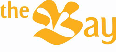
Centuries later, the Hudson’s Bay Company observed the desire for a diverse range of merchandise. The first 6 department stores were opened in 1913 across Canada and the store became a one-stop shop for many Canadian families. In 1965, The Hudson’s Bay Company rebranded to what many Canadians called it anyway – The Bay.
Branding Blunder
The mid-1990’s and early 2000’s saw a massive explosion of American retailers entering Canada. The Bay was slow to respond to new trends, and the ageing stores looked outdated and the brand identity seemed unappealing compared to its modern American competition.
Most notably, Wal-Mart entered Canada in 1994 and took a huge chunk of The Bay’s market share. The “high-low” pricing method of using weekly flyers no longer worked in a world of the constant “everyday” low pricing that Walmart promised.
The Turning Point
The Bay had no choice but to reinvent itself and come up with a new brand identity. The store allotted a massive budget to renovate its ageing stores and marketed themselves as a high-end retailer with a throwback to their past. How did they do that?
In 2011, The Bay secured Canadian franchise rights to the trendy UK retailer Topshop, and in 2013, the American luxury retailer Saks Fifth Avenue.
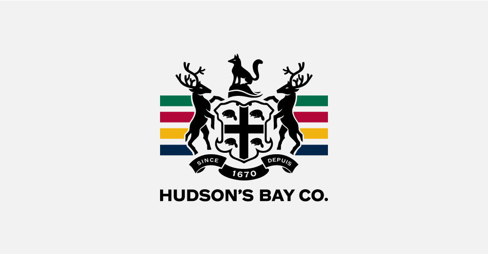
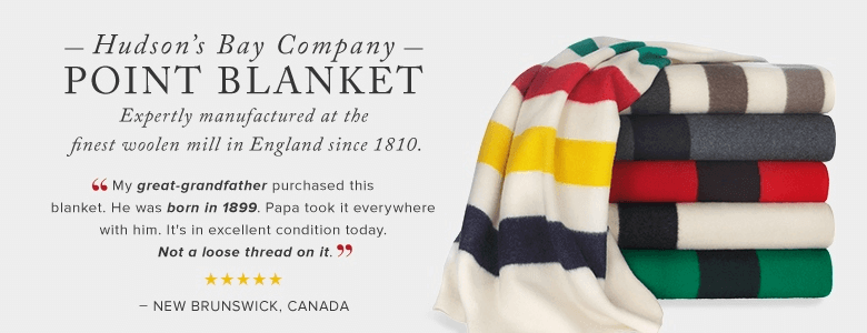
The Bay also rebranded themselves as Hudson’s Bay and revamped their logo to incorporate the original coat of arms. To give a nod to the company’s rich Canadian heritage, they reintroduced the early 18th century Hudson’s Bay blanket into its stores.
As a result, with the new logo and brand voice, the Hudson’s Bay rebranding efforts quadrupled their net income in a one-year period. The company exists still today, after almost 150 years!
This example shows that a brand overhaul is sometimes necessary to stay in business and refreshed visual elements can bring forgotten brands back to the top.
2. Keds
Continuing with successful rebranding examples, let’s see how one of the popular shoe companies introduced their new brand colors.
Keds has been a staple American brand for the last 100 years thanks to Charles Goodyear Jr., an inventor who played with rubber. He discovered the rubber vulcanization process that was perfect for the soles of shoes, and in 1916 he paired up with U.S. Rubber to make Peds.
The problem was that Peds was already trademarked, so instead they chose the name Keds.
Keds positioned themselves like no other company at the time by marketing to women. In a time where women weren’t allowed to vote, Keds marketed their shoes as providing “…ladies with accessible, fashionable footwear to allow them to be who they wanted to be, and go where they wanted to go.”
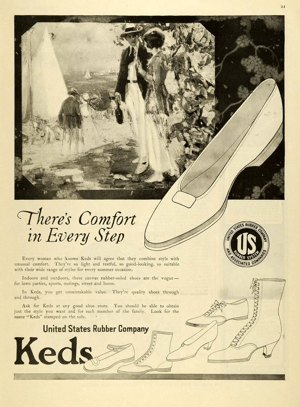
The shoes were popular among women who wanted something other than high heels. Marilyn Monroe and Audrey Hepburn wore Keds, and Yoko Ono even wore a pair of the iconic white shoes on her wedding day.
The brand promise towards women was a key marketing strategy, but the company’s mission wasn’t enough to stand the test of time.
Keds’ popularity increased through the 60’s and 70’s with their athletic line, and again in the 80’s and early 90’s with DJ Tanner (Full House) and Kelly Kapowski (Saved By The Bell) sporting shoes.

Branding Blunder
Keds didn’t so much blunder as it fell out of favor. The brand didn’t keep up with current trends and failed to appeal to the upcoming millennial generation. It chased its ageing consumer base that simply didn’t want to wear the same shoes that they wore in their 80’s heyday.
The company identity was outdated. They needed a new slogan, brand guidelines, and a rebranding campaign.
The Turning Point
Keds saw a minor resurgence in the mid-2000’s when original Keds wearers wanted the simplicity of the shoe. However, Keds really took off in 2012 when the company decided to sign Taylor Swift as a spokesperson.
Keds president Chris Linder wanted to capture a new generation of women that have “…been leading an exciting cultural shift redefining the conversation about equality and female empowerment.”
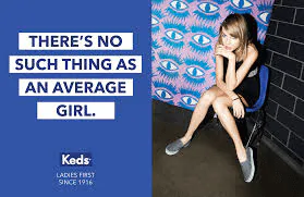
The result was their ‘Ladies First Since 1916’ campaign. The goal was to be “…a celebration of amazing women like Taylor Swift who are blazing new trails every day. From CEOing to BFFing, these ladies are doing it all.”
With such an incredible reach to a pre-teen and teen demographic, the campaign was a huge success. Keds has had a huge resurgence in popularity and now has a massive social media following. They’ve also expanded their offerings with a huge variety of color and design choices, including Taylor Swift’s “Red” and “1989” lines.
The new brand messaging, logo change, and a more modern mission statement make Keds a great example of rebranding while maintaining the core values.
3. Stella Artois
Among other fruitful rebranding examples is a famous beer Stella Artois.
Stella Artois has been around since 1336 and was originally brewed as a limited edition beer for Christmas. Its popularity grew because of its fresh ingredients, and became a fixture in Belgium. For centuries, the beer was always seen as a pricey treat by many Europeans. That was until 1981 when the company changed the price as a bold move, and started the “Reassuringly Expensive” marketing campaign. It worked – Stella Artois successfully turned the narrative of being an expensive brand into a sophisticated and upmarket choice of drink, still paying homage to its roots.
Branding Blunder
Stella Artois became the drink of choice for many not because it was seen as high class, but because it had a higher percentage of alcohol than many beers. The beer was pictured alongside football fans rioting, and the brand was blamed for encouraging binge drinking and alcohol-induced violence.
The brand further fell from grace when the beer began to sell in supermarkets. It was heavily discounted, and was no longer seen as “reassuringly expensive” since it was just another cheap beer to choose from.
The brand recognition ceased to be associated with positive emotions and the company needed a new direction to stay relevant.
The Turning Point
In 2008, Stella Artois took another step forward by launching a new lager with a lower alcohol content of 4.8% (from 5.2%) to show their commitment to battling binge drinking.
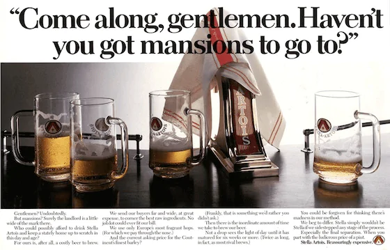
In 2010, they launched their “thing of beauty” campaign that included their ‘9 Step Preparation guide’ that implied the consumer needed skill and a certain amount of grace to pour the perfect pint of Stella. In an effort to invoke a sense of craftsmanship surrounding their beer, Stella also redesigned their logo to incorporate a coat of arms and a chalice.
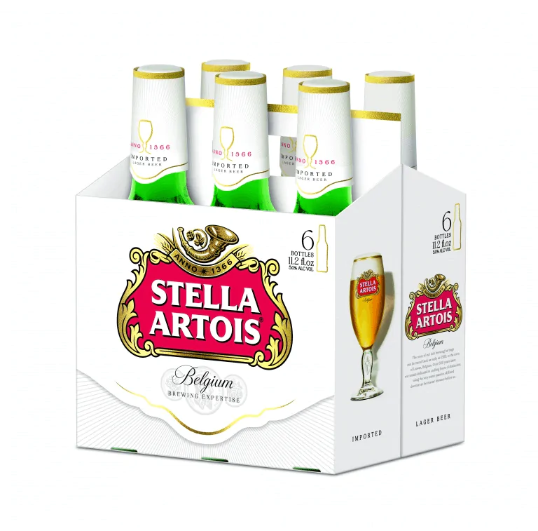
The rebranding worked – Stella is the best selling beer brand from Belguim and is sold in over 100 countries worldwide. The beer has also been recognized as being “sophisticated” by consumers, and “the best premium lager” in 2013 by the Morning Advertiser.
4. Airbnb
Did you know that this hugely recognizable brand has now been more than 10 years with us? Let’s see how it’s one of the best examples of rebranding strategies.
The idea for Airbnb came into existence when founders Brian Chesky and Joe Gebbia couldn’t afford to pay rent. The duo made their first $240 by renting out their loft to 3 people for $80 a piece. What a way to start own business!
The success spurred an idea when the 2008 Democratic national convention rolled around. The founders coordinated the launch of Airbnb by advertising rooms found on Craiglist to the attendees who couldn’t find a hotel room.
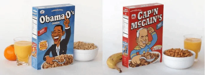
To raise further awareness and money for Airbnb, Brian and Joe showed up to the convention with custom Obama O’s and Cap’N McCain’s boxes of cereal. They quickly sold out, and Airbnb raised their first $30,000 in funding.
In the following 3 years, Airbnb grew exponentially. By 2011, they secured $112 million in funding and hit the 1 million mark of nights booked.
Branding Blunder
Later in 2011, Airbnb had a marketing disaster when “EJ”, a host’s house, was vandalized. The company offered no compensation for the damages, and stated that they do not insure against losses. The tepid response went viral, and many hosts openly bashed the company online.
In addition to this, in 2013, a renter was fined $2,400 for renting out a room in his apartment in New York. The man challenged the fine in court and the legal battle between the City of New York and Airbnb dragged on for a full year.
This PR crisis could potentially confuse customers and Airbnb needed new messaging to overcome the difficulties. One of many rebranding examples fueled by a PR crisis.
The Turning Point
After immense pressure, Airbnb changed their tune. They eventually compensated “EJ” for the damages done to her property and now offer a $1 million guarantee to hosts. Airbnb also won the $2,400 court case, which was very fortunate because if they had lost, they would have had to shut down their business in one of the biggest tourist capitals in the world.
With the legal disputes behind them, Airbnb decided to design an overall brand that went beyond rooms and logos. They enlisted the help of DesignStudio to craft a rebranding strategy that created a sense of belonging. The result was their “welcome home” campaign.
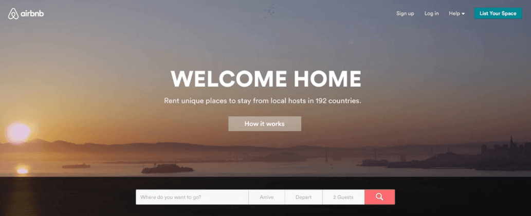
The Airbnb logo and color were also changed to reflect the sense of belonging. The company chose the Belo symbol as a representation of people, places, and love (the 3 corners) that form into the shape of an “A”. They also dropped the blue and white colors in favor of a vibrant red that is supposed to be reflective of passion and love.
Even though the logo redesign was highly criticized, the brand has grown significantly in the last two years, and is now estimated to be worth $30 billion. After all, the rebranding strategy worked, and the same branding design is starting to be an iconic representation of travels around the world.
5. Pizza Hut
Pizza Hut began in 1958 by two Wichita State students and was named as such because they only had space for nine letters on the sign.

Pizza as a fast food was completely new to the market at the time and Pizza Hut quickly expanded their operations across the USA. In 1973, the company opened its first international chains in Canada, Britain, and Japan and is now the largest pizza franchise in the world.
Branding Blunder
In the last decade, Pizza Hut has seen some fierce pizza competition. There were restaurants that differentiated themselves for their artisanal pizzas, and pizza-by-the-slice restaurants had an advantage of being quick and cheap. Pizza Hut fell somewhere in between, and so the chain fell out of favor by offering neither fresh nor cheap pizzas.
Adding to the competition, their reputation took a huge hit when a YouTube video came out showing two employees sticking cheese up their nose and serving it to customers. Another video surfaced of a manager urinating in a sink.
As a result, Pizza Hut’s market share in the pizza world dropped from 19% in 2008 to 16.7% in 2013. The popular pizza chain needed a rebranding strategy that would end the identity crisis it faced.
The Turnaround
In 2014, Pizza Hut unveiled a new, modern logo and introduced a new “Flavor of Now” menu after some consumer research.
The chain reached out to food truck owners in New York to understand what the younger generation wanted out of food. What they found was consumers wanted more variety and choice of ethnic and experimental flavors. Millennials also wanted the choice of organic and fresh ingredients, so Pizza Hut delivered. Such research is a vital part of a successful rebranding strategy.
The new menu emphasizes fresh ingredients, and pizzas like the Pretzel Piggy (garlic parmesan, bacon, mushrooms and a balsamic “drizzle”) and crust options like Honey Sriracha are now offered.
As a result, Pizza Hut is on the mend and its profits are steadily increasing after a few rocky years.
6. Old Spice
Old Spice was established in 1937 as a men’s grooming brand, initially known for its shaving soap and aftershave lotion. Over time, the brand expanded its product range to include deodorants, body washes, and fragrances.
Branding Blunder
By the early 2000s, Old Spice faced challenges in staying relevant and appealing to younger consumers. The brand became associated with an older generation and struggled to compete with newer, more innovative competitors in the men’s grooming market. Though Old Spice did not experience any specific branding blunders like Pizza Hut, the company faced a decline in market share and needed a new branding strategy to reestablish its image and attract a younger demographic.
The Turnaround

In 2010, Old Spice launched the “Smell Like a Man, Man” campaign, which marked a significant turning point for the brand. This campaign featured the now-iconic “Old Spice Guy” (Isaiah Mustafa) and a series of humorous, over-the-top commercials that quickly gained attention and went viral.
The campaign was a major success, significantly increasing Old Spice’s sales and social media presence. It breathed new life into the brand and effectively changed its image from an outdated product for older men to a modern, desirable grooming brand for a younger demographic.
The campaign was a major project. Not only was it labor intensive – it required an entire studio equipped with custom-made equipment, cameras, and a qualified crew – but it was also that crazy, risky idea that somehow worked. Take a look at the behind the scenes of the production in the video below.
Know What Consumers Say About You Online
These rebranding examples show us that you need to be aware of your company image. If you are suffering a PR crisis or would like to reposition your business into another market, you need to know what people are talking about your brand.
In order to know what consumers say about your brand online, you can use a social listening tool like Brand24. It tracks in real time all mentions relevant to your brand and business, which allows you to control your brand image. Various metrics give you the image of the situation. You can try out Brand24 for free.
If social listening sparked an interest, take a look at our other articles.
FAQ
How do you do rebranding?
Rebranding is a process that involves redefining and changing the image, message, and perception of a brand. To execute a successful rebrand, follow these steps:
- Analyze the reasons for the rebrand,
- research the target audience and their preferences,
- develop a new brand strategy, including vision, mission, and values,
- create a new visual identity, such as logos, color schemes, and typography,
- update marketing materials and communication channels,
- launch the new brand internally to employees,
- announce the rebrand to the public through a well-planned marketing campaign.
What brands need to be rebranded?
Victoria’s Secret – The brand has faced criticism for its outdated and exclusionary image, lack of inclusivity and diversity, and declining sales. A rebrand focusing on inclusivity and modernizing the brand could help the company attract a younger, more diverse audience.
McDonald’s – The fast-food giant has struggled to keep up with changing consumer preferences for healthier and more sustainable food options. A rebrand focusing on fresh and healthy ingredients and highlighting the company’s sustainability efforts could help McDonald’s appeal to health-conscious consumers.
Sears – The department store chain has struggled to compete with e-commerce giants and newer, more innovative retail brands. A rebrand focusing on unique in-store experiences and emphasizing the company’s heritage could help the brand regain relevance and attract a younger demographic.
Why did Burberry rebrand?
Burberry rebranded to revitalize its image and attract a younger, more fashion-forward audience. The company faced challenges with an outdated image, counterfeiting issues, and a diluted brand identity. The rebrand involved a new logo, monogram, and creative direction, focusing on modernizing the brand while maintaining its heritage and luxury status.
What is included in a company rebrand?
A company rebrand typically includes:
- a new brand strategy, encompassing vision, mission, and values,
- a new visual identity, such as logos, color schemes, and typography,
- updated marketing materials, including packaging, advertising, and digital assets,
- revised internal and external communications,
- employee training on the new brand identity and messaging, and
- a launch campaign to announce the rebrand to the public.
Author Bio:
Sacha Doucet is a Small Business Marketing Consultant who helps take the guess work out of growing a business by developing and implementing easy-to-follow digital marketing strategies. Along with offering digital marketing services, she also offers content writing services that attracts organic traffic, boosts audience engagement, and increases brand awareness.
Read also: Does your brand need rebranding or brand repositioning?
Related articles
-
 Show article >
Mar 28, 202412 min reads
Show article >
Mar 28, 202412 min readsEverything You Need to Know About Blog Monitoring
-
Show article >
Mar 18, 20248 min reads
Everything You Need to Know about YouTube Monitoring
-
Show article >
Mar 1, 202410 min reads
Everything You Need to Know about Instagram Monitoring
-
Show article >
Feb 29, 202413 min reads
Top 10 Competitive Intelligence Tools to Use in 2024
-
Show article >
Feb 5, 202411 min reads
Everything You Need to Know About Online Review Monitoring